Personal analytics
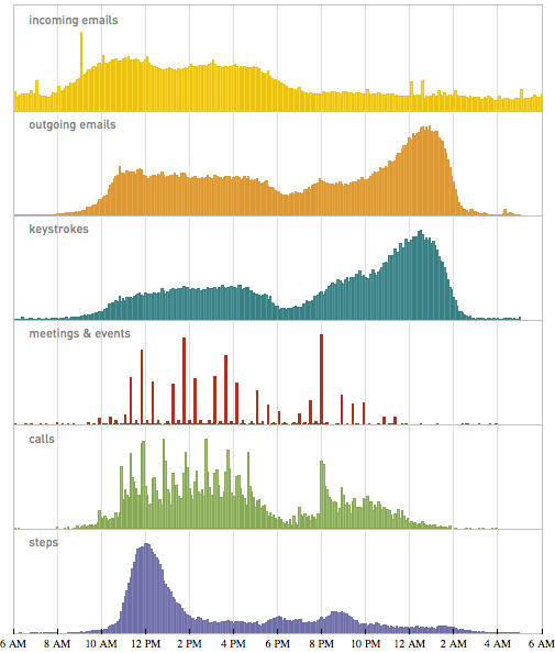
I was the lead data analyst on Stephen Wolfram’s personal analytics blog post in March 2012. It was a challenge in telling a story about someone’s life through their personal data. This stacked distribution plot summarizes much of the daily rhythms we uncovered:
We got a lot of comments on the blog from people asking how to analyze their own personal data. So we wrote a series of follow-up posts showing concrete examples of analyzing personal data using Mathematica.
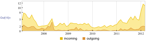
I started with an email analysis blog post, showing how to snarf your email from the gmail IMAP server, and plot things like a timeseries of email volume:
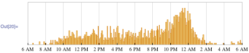
… and the distribution of sent and received email by hour of the day:

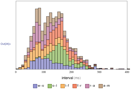
The email blog post got a lot of traffic and some press, so I followed up with a post showing how to analyze your keystrokes, with an interface that captures your keystrokes as you type the word “wolfram”:
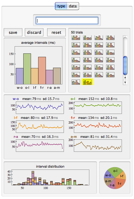
The interface allowed you copy the raw data to the clipboard, so I asked the nerds at Wolfram to send me their keystroke data. I computed the distribution of intra-character intervals:
I summarized my keystroke analysis and other quantified self adventures at Wolfram at Data Rave NYC: